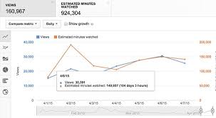
YouTube has outlined two new charts in Studio Analytics which can provide more context as to comparative video performance, and may help guide your strategic approach.
The first new chart maps YouTube video performance in dot or scatter plots, showing the performance of each of your video uploads on a single chart.
As you can see here, the new chart provides further context on video performance for comparative time frames, relative to the publish date of each. You can display up to 100 videos at once, and sort the listing by ‘First 24 hours’, ‘First 7 days’ or ‘First 28 days’. You can also compare various metrics, including views, impressions, and average view duration.
To access the new chart, you click on:
Channel analytics > Advanced mode > Compare to’ . ‘First 24 hours video performance’
From there you can further sort the data, and expand the time frame via the options on the left-hand side of the screen. The charts are available for any video published from 2019 onwards, but as noted, only 100 videos can be displayed at one time.
Additionally, you can also see that the lower table listing (in the image above) is divided into ‘Top performing videos’, ‘Average’ and ‘Bottom performing’ uploads, with the top and bottom five also highlighted on the chart. In that lower listing, YouTube advises creators to look for common themes among your best and worst performing posts.
“This report is really helpful in identifying content trends on your channel over time.”
Via the ‘Top performing’ and ‘Bottom performing’ lists, you can note topic trends, thumbnail images, length – each metric could be indicative of key performance elements worthy of note.
In this example, YouTube notes that many of the top performers are about algorithms, which is clearly of interest to the channel’s audience, while several of the worst performers have ‘more on’ or ‘more info’ in the title, which could be indicative of title issues to watch for in future.
The second new comparative chart maps performance over the first 24 hours for one video against another, as opposed to looking over many videos on a single chart.
To access this, you need to click on the ‘Since published’ drop-down in the top right of the main Analytics screen, then select ‘First 24 hours’. That will bring up this chart displaying your video performance on a given day.
From there, you can click on ‘Advanced mode’ at the top right of the window, then select ‘Compare to’. You can then look up any other video from your previous uploads, which you can search by keyword, date published or by looking through the drop-down list.
That gives you comparative performance metrics on the two clips, providing more insight into individual video performance.
YouTube notes that the first 24 hours is not of specific importance to its recommendation algorithm, nor is it indicative of future video performance. Typically, YouTube says, creators want that 24-hour data in order to get some idea of how their new content is being received, on balance with their regular clips.
In addition to this, YouTube also recently began rolling out a new card in Studio analytics which displays the most viewed channels your audience has been watching other than yours over the preceding 28 days, which could provide more context on their interests.
That could help give you some guidance as to where you should be looking to get a better understanding of key trends and creation styles, which could help improve your own audience retention. It could also help you find relevant topic ideas for your clips.
YouTube also notes that this listing could help in determining potential collaboration opportunities with other channels that your audience is interested in. The new card is only available on the desktop for the time being.
There are some handy tools here, which could provide a range of opportunities to enhance your YouTube approach. Definitely, if you’re looking to seriously boost your YouTube performance, it’s worth taking a look at how these new options might help.

Your point of view caught my eye and was very interesting. Thanks. I have a question for you.
I don’t think the title of your article matches the content lol. Just kidding, mainly because I had some doubts after reading the article.
I don’t think the title of your article matches the content lol. Just kidding, mainly because I had some doubts after reading the article.
Thank you for your sharing. I am worried that I lack creative ideas. It is your article that makes me full of hope. Thank you. But, I have a question, can you help me?