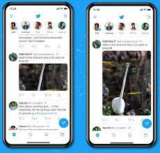
After testing it out over the last couple of months, Twitter is now rolling out its new tweet image display format, which will mean that full-sized previews of attached tweet images are now shown within user timelines, as opposed to the current cropping down to fit your picture into a specific tweet image frame.
You can see the current display on the left, versus the new format on the right. Rather than being cropped to within an inch of their life, making it difficult to see what the image actually is in many cases, Twitter will now show full-sized pictures in the timeline, which will change the way tweets are displayed – and will likely have a few implications from a digital marketing perspective.
The main change in approach relates to the larger tweet display for tweets with images, which equals more screen real estate, and more room to share your message. That could mean that attaching images will improve user response to your brand message, as it will be larger, and will stand out more in-stream – so you may want to experiment with images a little more in your Twitter process as a result of this update.
It also means that you no longer need to try and calculate exactly the right dimensions to ensure that users can see your attached image in the timeline.
Though there are some provisos to this – as explained by Twitter:
Within those parameters, you’re good to go – so you will still need to ensure your Twitter images meet these requirements. But you won’t have to upload different versions till you get just the right one that displays as you want in the feed.
And there is one other implication, as noted by Conviva’s Nick Cicero:
This is an interesting, and valid consideration to keep in mind. If users no longer have to click on your tweets to expand your attached images, that will also likely result in a decline in engagement with your tweets. So if you regularly post images, and your numbers take a dip, this could be the reason why. Worth noting in your process.
It is also worth noting that this only applies to single-image tweets. Tweets with multiple images will still be displayed in the older format – so if you want to keep using the ol’ ‘open for a surprise’ tweet engagement trick, you still can, just with multiple images instead.
It seems like a good addition, which will make your Twitter feed a more visually interesting space. Though it could take some getting used to – and again, for brands, it could mean that tweets with images generate a lot more user interest, due to the variable size and display.
Which could also, eventually, make this an annoying update. If brands work out that using the max image size is the best way to dominate space, that could render popular hashtags streams virtually unfollowable, as trend jacking reaches new (visual) heights – though Twitter is also working on curated topics to help improve this experience.
Still, it’s an interesting update, which is sure to have implications to come.
Time to start experimenting with your tweets.
The new display update is now live in the latest version of the app.

Thank you for your sharing. I am worried that I lack creative ideas. It is your article that makes me full of hope. Thank you. But, I have a question, can you help me?
I don’t think the title of your article matches the content lol. Just kidding, mainly because I had some doubts after reading the article.
Thanks for sharing. I read many of your blog posts, cool, your blog is very good.
I don’t think the title of your article matches the content lol. Just kidding, mainly because I had some doubts after reading the article. https://www.binance.info/pt-BR/register-person?ref=YY80CKRN
Thanks for sharing. I read many of your blog posts, cool, your blog is very good.
Your point of view caught my eye and was very interesting. Thanks. I have a question for you.