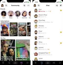
Snapchat is testing out a major new redesign which would expand the app from three to five definitively separated sections, and add a black navigation bar along the bottom of the screen.
As reported by Casey Newton in The Interface, and as you can see in the above images, the new navigation bar would link to five sections.
- The first would be the Snap Map, which is currently accessible by swiping down on the main camera screen, though is not clearly noted as such anywhere in the app
- The second is the chat section, where you can conduct message conversations with friends (second screenshot above)
- The third is the main camera, which the app opens to
- The fourth is essentially the current Snap Discover section, but renamed ‘Community’, which would feature all the content from connections, people you follow, personal recommendations, etc. (first screenshot above)
- The fifth would be the new ‘Discover’, which would showcase Snap’s original programming, which has seen a significant boost in viewership over the past year
Currently, the 1st and 2nd tabs, and the 4th and 5th are compressed into a single tab each, but the new format would give each more dedicated space – and most notably, would make it much easier for newcomers to navigate their way around the various tools and features.
Of course, that’s never really been Snapchat’s concern. Snapchat’s less than user-friendly design is actually a feature – with the app’s various tools being a little more hidden, it’s meant that Snapchatters have had to share how to find them among themselves, giving the app an extra level of exclusivity. It’s also, some have suggested, been built this way to keep older users out – if people logging on can’t understand it, they move on, which, in many ways, is how Snapchatters would prefer it.
But now, Snapchat needs more users. Snapchat did add 8 million more daily actives in Q4 ’19, taking it to 218 million DAU to end the year, but in order for the app to maximize its revenue potential, and justify its increasing data storage costs, it needs to keep growing, as much and as fast as possible.
Improving the way in which people are able to use the app could be one way of doing this, and while Snapchat’s last major redesign was not well received, and reportedly led to many users abandoning the app, it’ll be hoping it can get it right this time around, maintaining connection with its current audience, while also opening the app up to broader interest.
Definitely, it seems to make sense. The map, for example, is a popular feature, but again, it’s not obvious how you can access it straight away, and giving it a dedicated space might also enable Snap to better utilize it for advertising or other purposes, simply by assigning it more focus. Showcasing its Snap Originals also makes a lot of sense – Snapchat says that more than 100 of its Discover channels are now reaching, on average, audiences in the double-digit millions per month. Separating them out from the other content could help Snap boost that viewership, while again, also adding another potential space for advertising simply by delineating clearer functional divides.
Another reported option in testing is a ‘Happening Now’ dedicated news section in the app, through which Snap’s team would provide a listing of curated news headlines from trusted providers.
