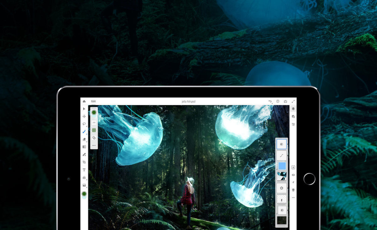
At the kickoff keynote for Adobe Max, the company’s massive annual creativity conference, 15,000 designers and creatives cheered as Photoshop on the iPad was unveiled on stage. The long-anticipated app had been teased since last year’s conference, and the air in the Los Angeles Convention Center was filled with excitement as attendees finally got to try it out in between workshop sessions and panels hosted by inspirational speakers. But online was a different story, as negative reviews poured in on Twitter and YouTube, confirming early reports that the app was missing key features and felt unfinished.
On YouTube, the first search results for Photoshop on iPad populate videos calling the app “disappointing” and “bad for colorists.” One gets straight to the point, with the title, “RANT: Photoshop for iPad SUCKS”. The sentiment is the same on Twitter, with artists questioning why the app is missing features that competitors like Procreate and the Affinity suite already offer on the iPad, and for a one-time fee, no less.
The outrage seems to stem from the fact that users felt misled by Adobe’s marketing of the app as “real Photoshop,” a term many took to mean that the app would mirror the desktop experience. To Adobe, Photoshop for iPad is “real”: it uses the same codebase as the desktop app, and files sync between the two so users can keep working across devices. But Photoshop for iPad is far from the “full Photoshop,” which would mean every tool and feature brought to the iPad. For now, only the basics are here.
It’s a mistake that Adobe’s chief product officer, Scott Belsky, has acknowledged over the past couple weeks, saying the company didn’t do enough in its messaging to emphasize that Photoshop for iPad would not be the full thing, especially on day one. A day after the app’s release, Belsky tweeted about the poor reviews, sharing a screenshot of Photoshop’s 2.3-star rating on the App Store (accompanied by a sad-looking Memoji) and calling the responses “painful.”
Belsky said that version one of Photoshop on iPad was a minimal viable product, a first iteration with the most basic set of features. He stressed that Adobe’s focus was on Cloud PSD support to allow users to work on the same file on the iPad and the desktop, as well as rethinking workflows and UI. Adobe also prioritized compositing workflows first, but in doing so, the first version of Photoshop has ended up alienating other user bases, mainly digital artists. In a response to one Twitter user’s complaint about the app’s lack of support for illustration workflows, Belsky directed them to try out Adobe Fresco instead.
The app’s shortcomings are also all the more apparent due to the increased competition that’s cropped up during its long development. During just the past year, Procreate — a $10 digital illustration app — added animation features (absent in Photoshop for iPad) and text tools, then announced that its next update would bring PSD brush compatibility. Meanwhile, has quickly made a name for itself as a budget Photoshop and Illustrator alternative with the apps Affinity Photo and Designer, which both cost $20. “Obviously Adobe has the vast majority of the creative professional market, so for them to promote workflows like this can only be a good thing for us, and validates what we have been doing with Affinity,” Ashley Hewson, managing director at Serif, said at the time Photoshop on iPad was announced.
Photoshop product manager Jenny Lyell said that some features have taken longer to develop, explaining the difficulties of working with the desktop and iPad’s shared codebase. “At the end of the day, we don’t want you creating something [on the iPad], and it outputs differently. That’s one of our architecture principles,” Lyell said. For example, tools like liquify, which is a plug-in on the desktop, are challenging to bring to the iPad, which doesn’t support plug-ins.
Early users will have more to look forward to in the coming weeks, as Adobe plans to update Photoshop for iPad at a much more aggressive pace. “At the very least, we’re looking at monthly updates,” Lyell says. In the Adobe blog announcing the app, Photoshop manager Pam Clark continually stresses that “this is just the beginning,” and encourages users to give feedback on which features they’d like to see.
Onstage at Adobe Max, Photoshop engineer Emily Bogue showed off a beta version of the app, which featured an AI-powered Object Select Tool that would be included in a future update. It was this part of the demonstration that elicited the most gasps from the audience, as she quickly masked out tricky parts like hair with the touch of a button. The tool will be making its way to the iPad version eventually, where, by that time, users will hopefully have gotten more of the features they’ve been wanting. But Photoshop on iPad’s success depends on whether those users are willing to wait when the alternatives can give them what they want now.

worldofttt.com worldofttt worldofttt|worldofttt.com|loans|payday|cash}